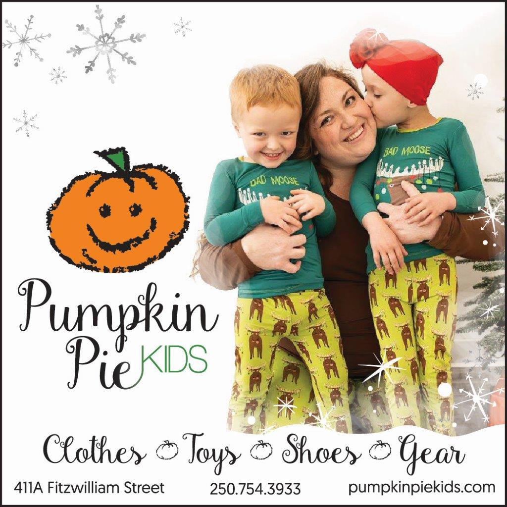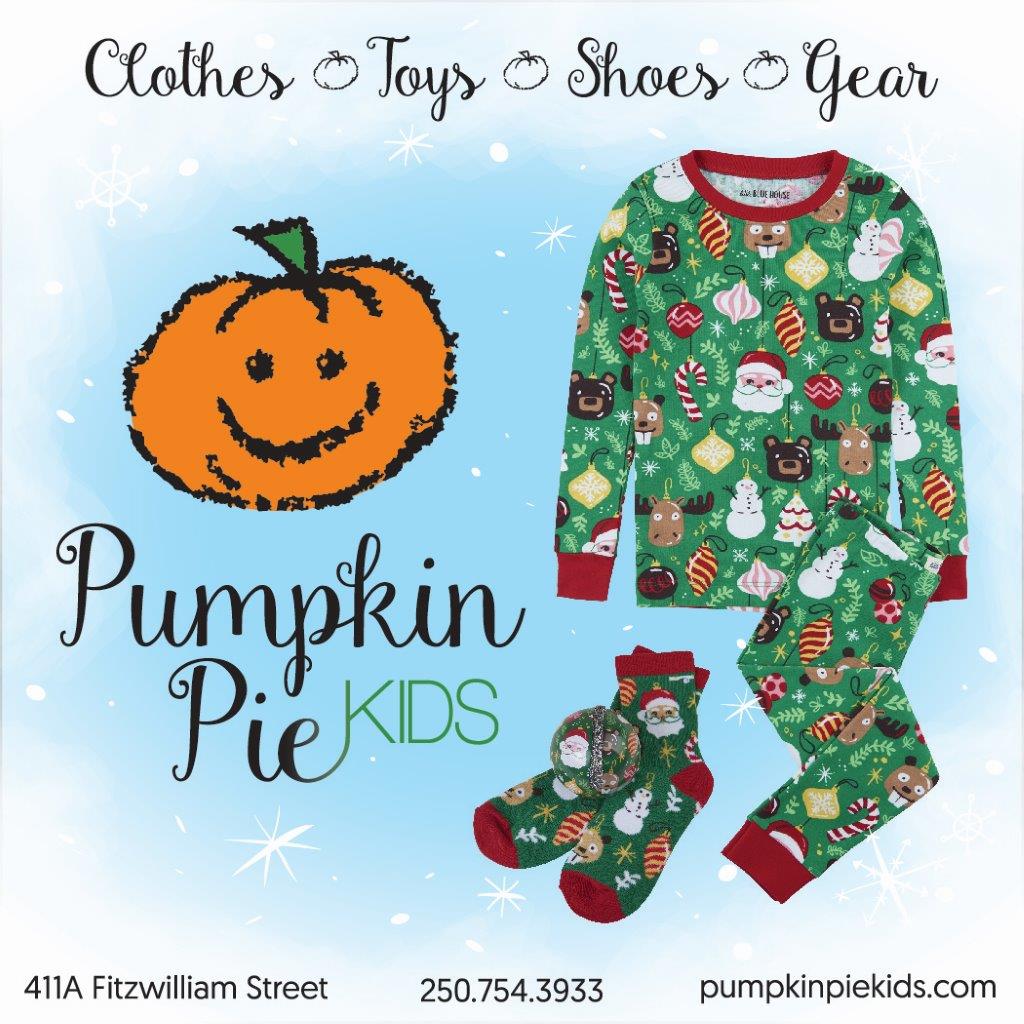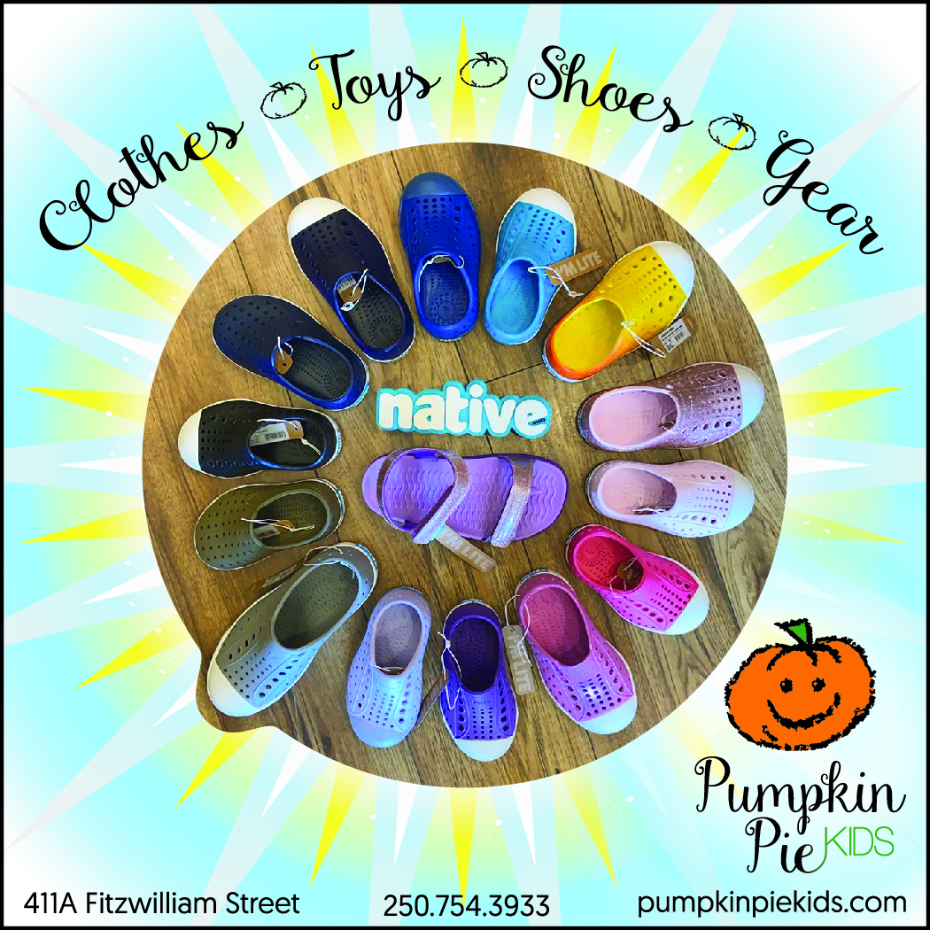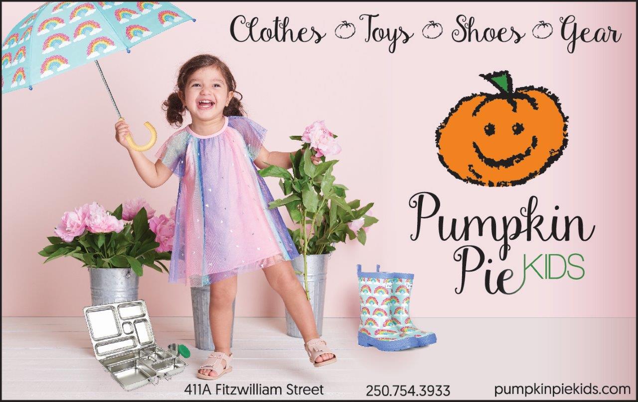
-PORTFOLIO PIECE-
Pumpkin Pie Kids

Logo Redesign
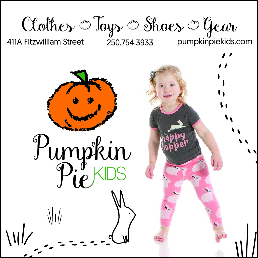
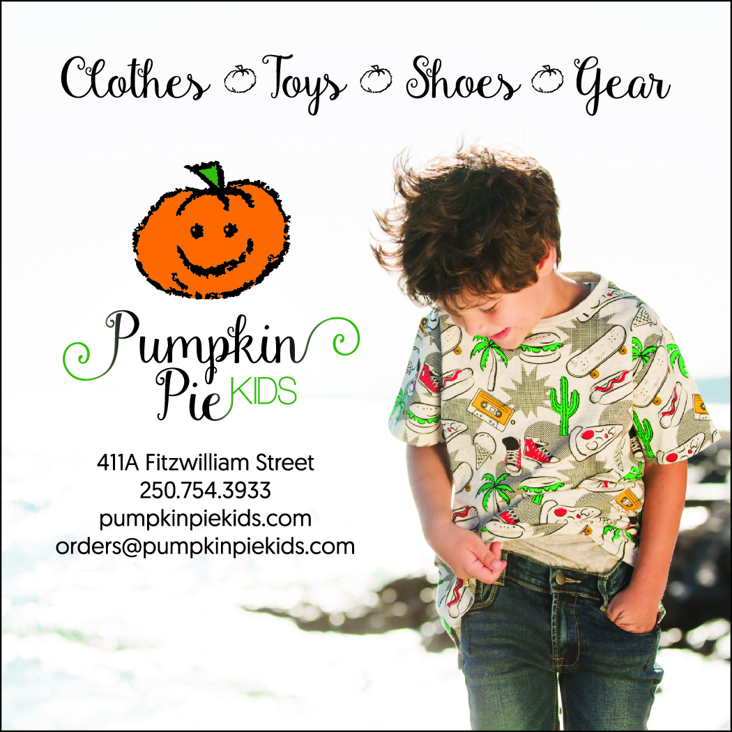
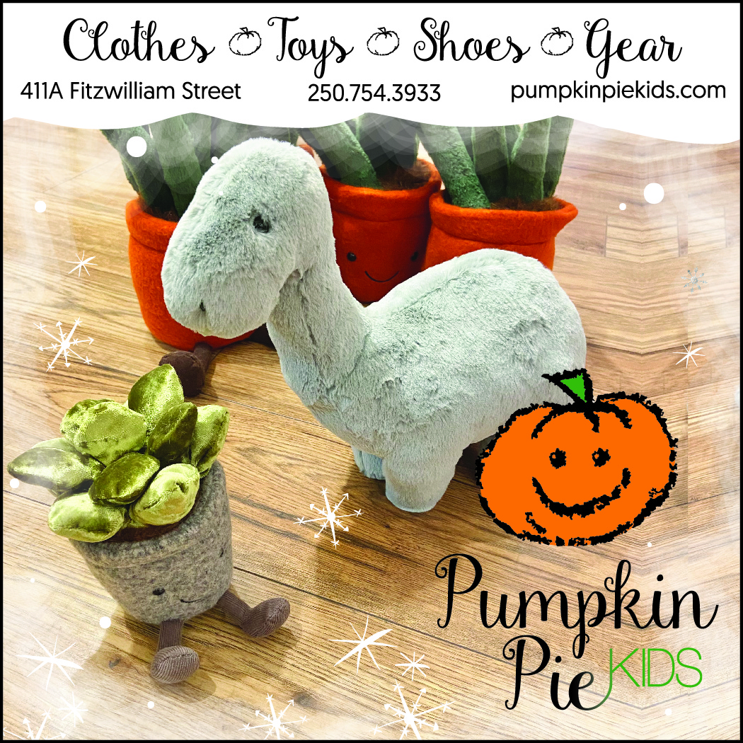
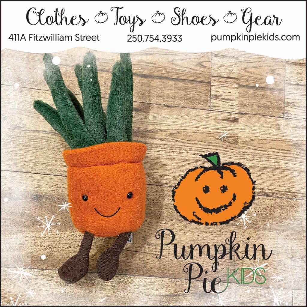
New owner wanted the typography to be more modern in a hand lettered look that flowed like a pumpkin vine and easy to read. They also wanted the pumpkin to look more “friendly” and inviting for their children’s store. Also created a logo with a pumpkin siblings/family for their website. One that showed different sizes of pumpkins to represent children of all ages
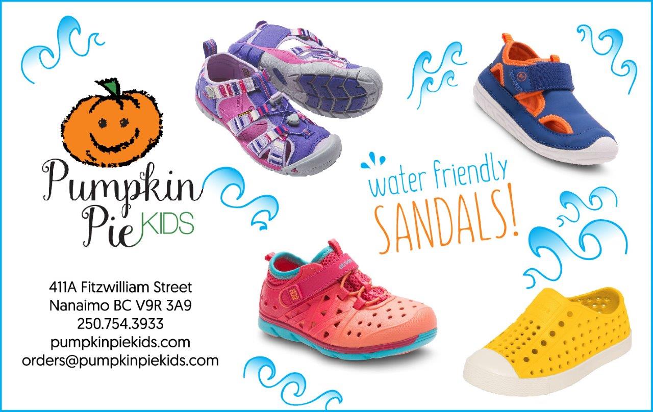
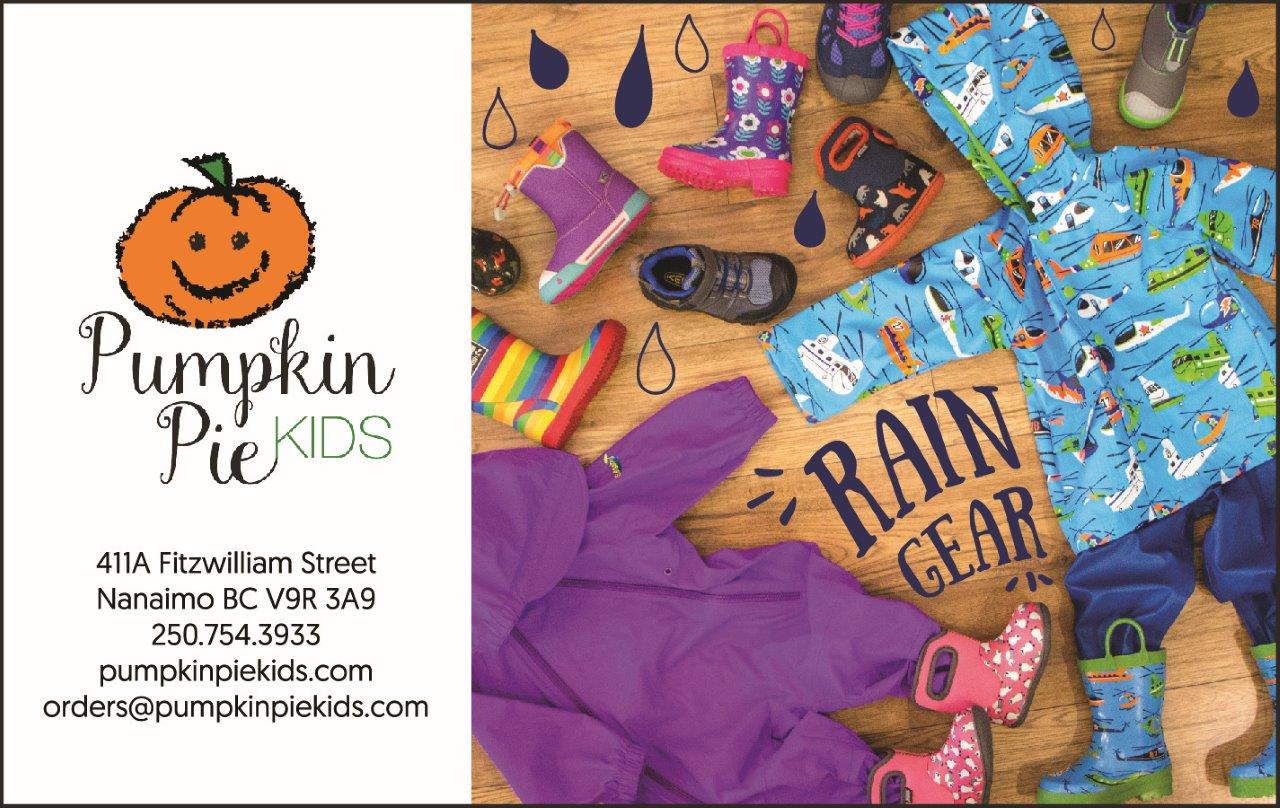
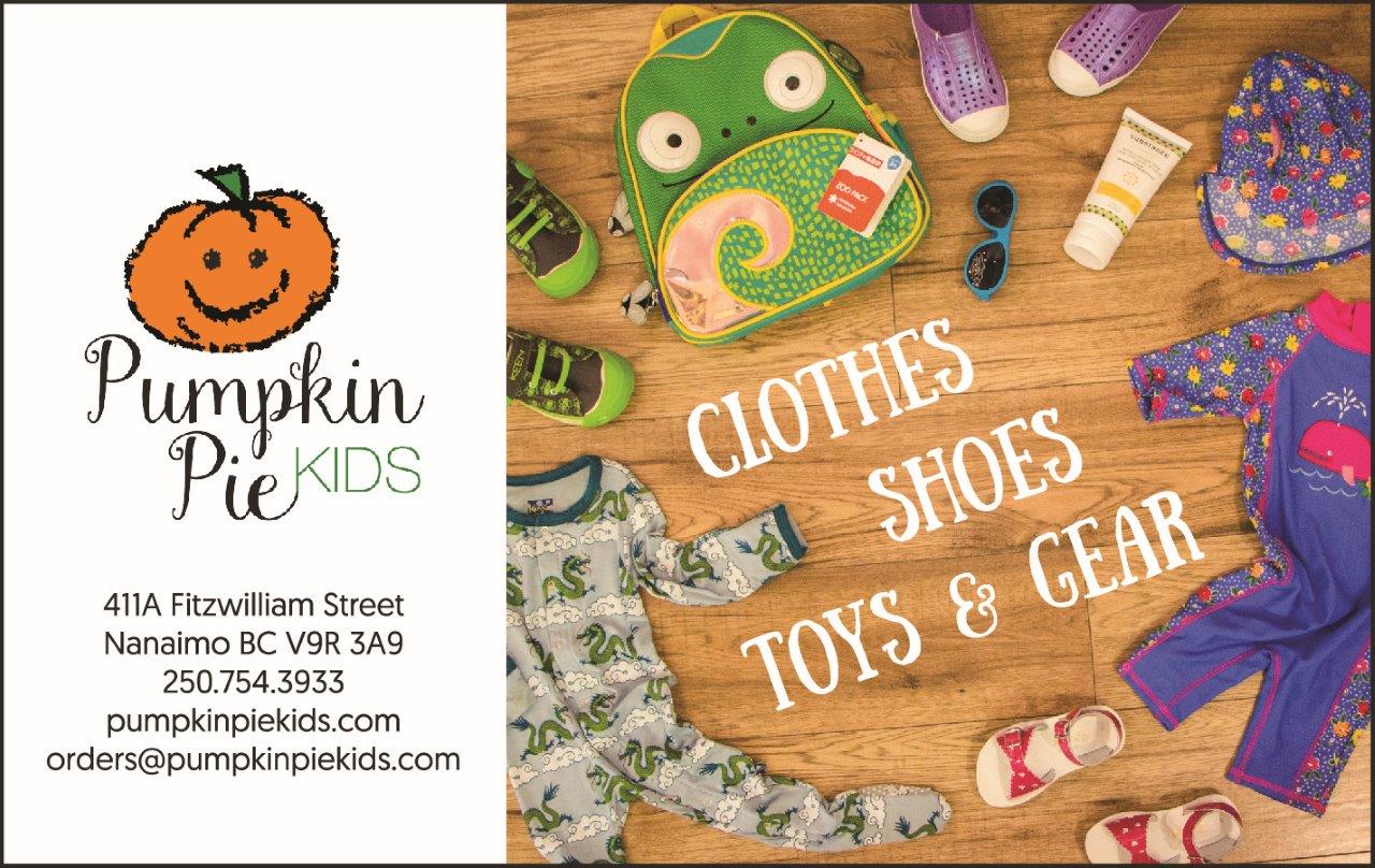
Designed Web Banners for their website, Magazine Ads, Newsletters and Social Media Posts.