-PORTFOLIO PIECE-
Blackberry Redesign
Brand redesign to appeal to a younger audience
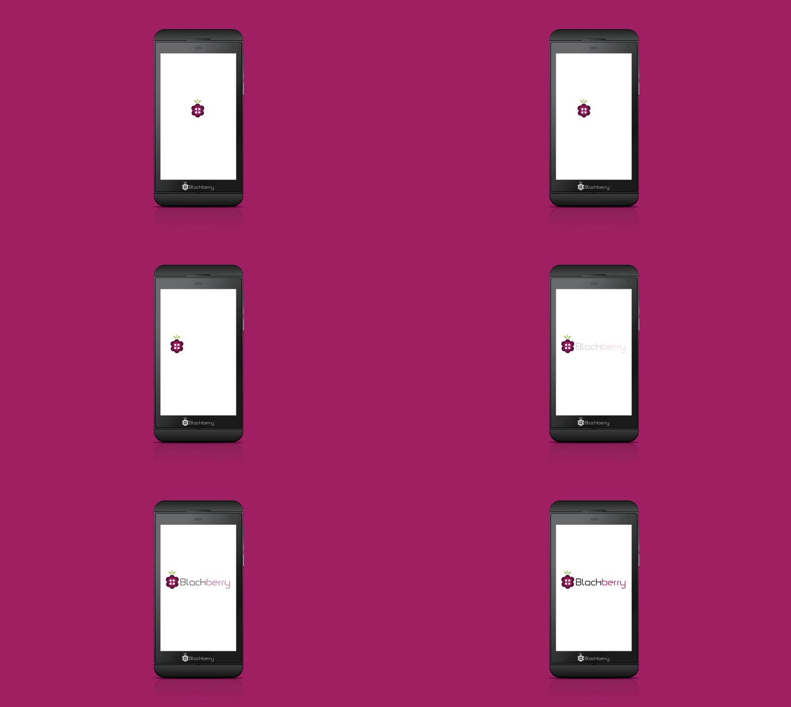
This is a rebranding logo I did for blackberry. My logo consists of two opposing B’s inside the blackberry, mimicking the keyboard on a blackberry phone. This logo caters to a younger audience and breaking away from a strictly business phone to gather a new market.


